University of Waterloo Greenhouse Gas Emissions Dashboard
Objective and Features
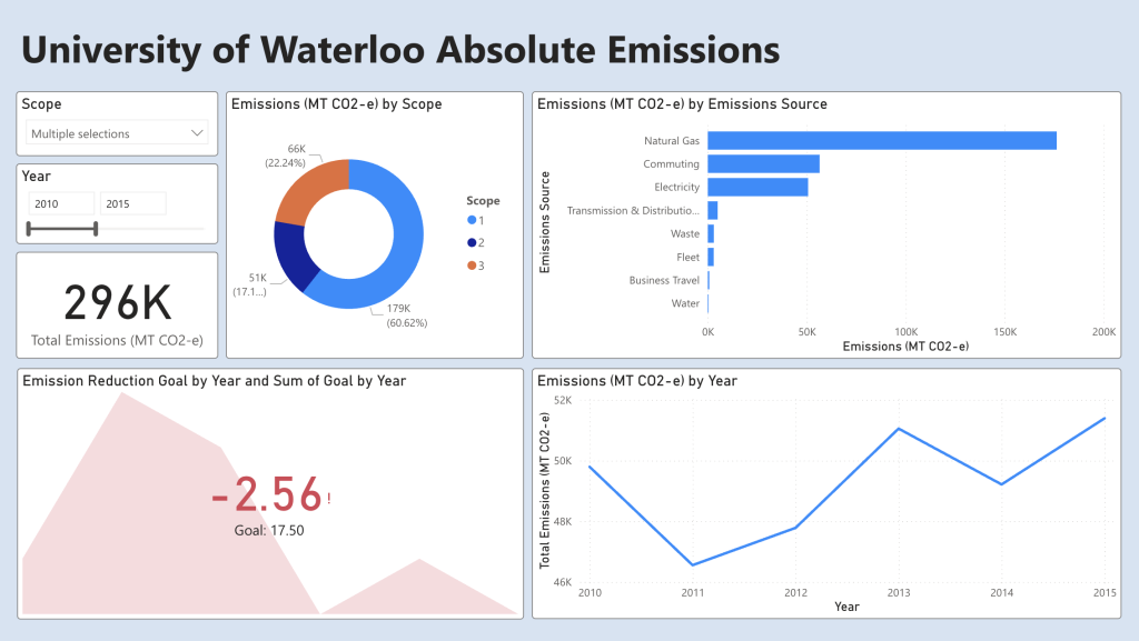
The objective of this project is to create a dynamic dashboard to display the greenhouse gas (GHG) emissions of the University of Waterloo including scope 1, 2 and 3 to give a better understanding of GHG emission trends and identify reduction areas to reach the goal of reducing scope 1/2 by 17.5% from 2010 by 2025. *Emission data used in this project are retrieved from the University of Waterloo website. A video demonstration of the dashboard is provided above.
The dashboard features 5 main visualizations that help breakdown the data and convey the trends more clearly.
1. Total emissions: Gives the total emissions across the selected years and scopes.
2. Emissions per scope: Emissions are sorted by scope 1, 2 and 3 and provides the total for each category.
3. Emissions per emission source: Emissions are sorted by the type of emission source.
4. Emissions per year: Emissions are sorted by year from 2010 to 2022.
5. Emission reduction goal: Analyze the annual GHG emissions against the reduction goal set by the university.
Additional Filters:
– Filter by scope: Allows the user to filter the emissions based on scope.
– Filter by year: Allows the user to filter based on year.
Main trends found from the dashboard:
– Natural gas, commuting, electricity, and business travels has the highest emissions
– Business travels drops in total emission during 2020 – 2022 due to travel restrictions and increased reliance on alternative communication methods
– Natural gas emissions remained constant during 2020 despite suspending in-person activity possibly due to necessary operations such as HVAC systems to prevent any damages to the building
Areas of improvement:
– improved insulation by swapping out older windows in old buildings
– retrofitting HVAC system to be more efficient
– Regular maintenance on HVAC systems to ensure optimal operational efficiency